Today is a big day for Sagebrush! As we are heading into the holiday season, we are implementing our coffee bags’ new look! This redesign has been months in the process. We sent out surveys to top customers. I can't tell you how many samples we've received or how many debates we've had over the last 3-6 months over this topic. We've bought new printers, new stickers & many other items to help implement this project. We didn't do all of this work without a reason, so here’s a little mini-essay giving the complete rundown on our thought process behind absolutely every move we’ve made in this redesign process, and how you, the valued customer, are benefitting from all of this.
Here at Sagebrush, we pride ourselves in providing some of the absolute best small-batch coffee you can find. Our direct-trade connections with farms around the world, our roasted-after-you-order philosophy, and our dynamic roasting profiles all serve in helping us stand out as the best of the best. It’s been amazing to see how these aspects of our business have aided in growing Sagebrush throughout the years. Whether it be by upgrading into a bigger shop, streamlining our roasting setup, or just plain hiring more employees, we have managed to keep up with this growth; but something that has not kept up is our packaging.
The packaging for our coffee (library cardholder with an informational card with country and logo stamps) has remained the same for more than six and a half years. To put that in perspective, six years ago to the date of us writing this post (November 29, 2013), we had one order. One single bag of coffee to package and ship for the day. Now, we are stuffing bins and bins of packaged coffee to be shipped out on a daily basis. The point is Sagebrush is a little busier than it was when we first started our packaging system, and a packaging design revamp was far overdue.
So, let’s get into the problems with the old packaging, and how our newly implemented system solves those problems, shall we?
Problem 1:
Our bags had a large margin for error
Although the old packaging may appear fairly simple, it takes a large number of different elements to reach a completed bag ready for coffee packaging. With the old system, a single completed bag consisted of a minimum of 7 different elements (Bag, cardholder, card, tape for cardholder, stamp to go on cardholder, stamp for logo, and stamp for roast date and weight, that doesn't even include the potential extra elements: stamp for decaf, stamp for swiss water process, stamp for grind level). Four of these elements were items we have to regularly purchase from outside vendors. This means that the moment there’s a slip-up in our inventory counts and we run out of even one of these items and don't replace it in time, we have to make compromises on our packaging. Some of you may have noticed this issue through the lack of info cards, oddly shaped quick-replacement bags, and different color envelopes in the packaging you ordered. Overall, the problem boils down to the fact that we were trying too hard to make a coffee package that in all honesty, looks exactly as it is: a card taped to a bag.
Solution:
Simplified, simplified, simplified
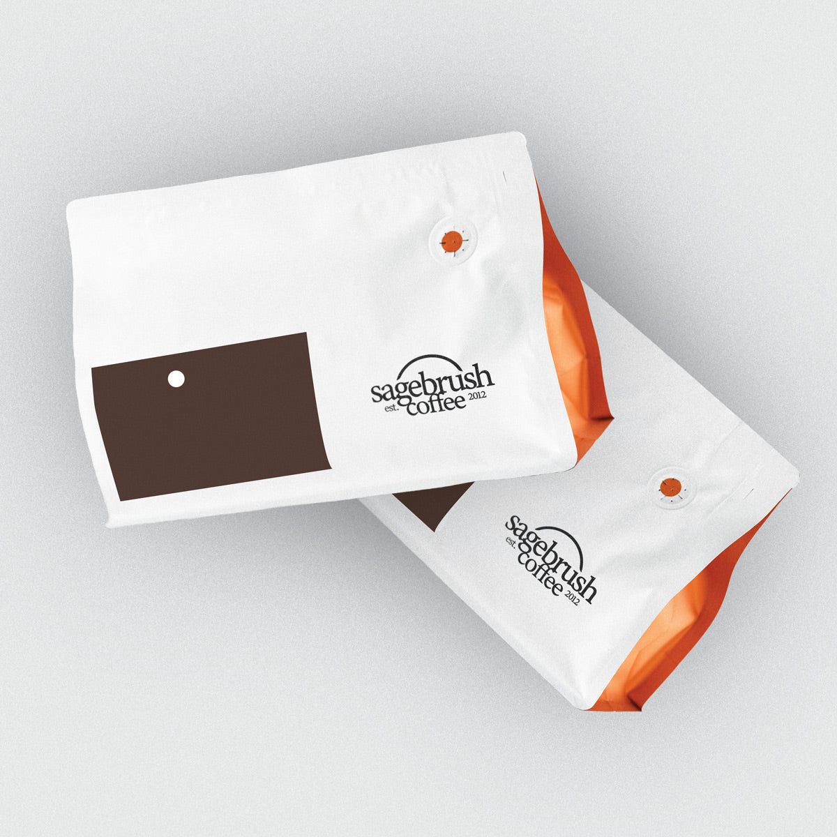
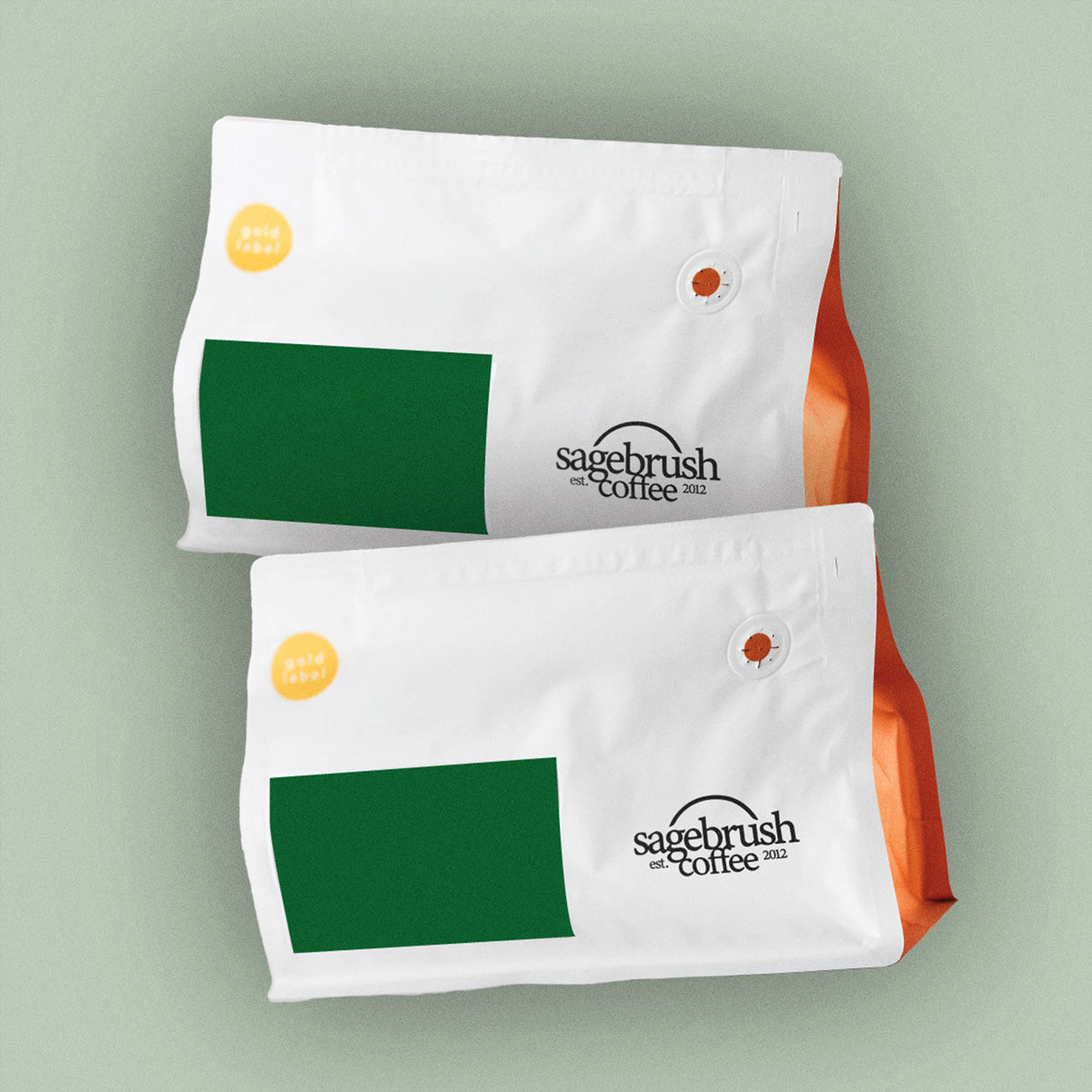
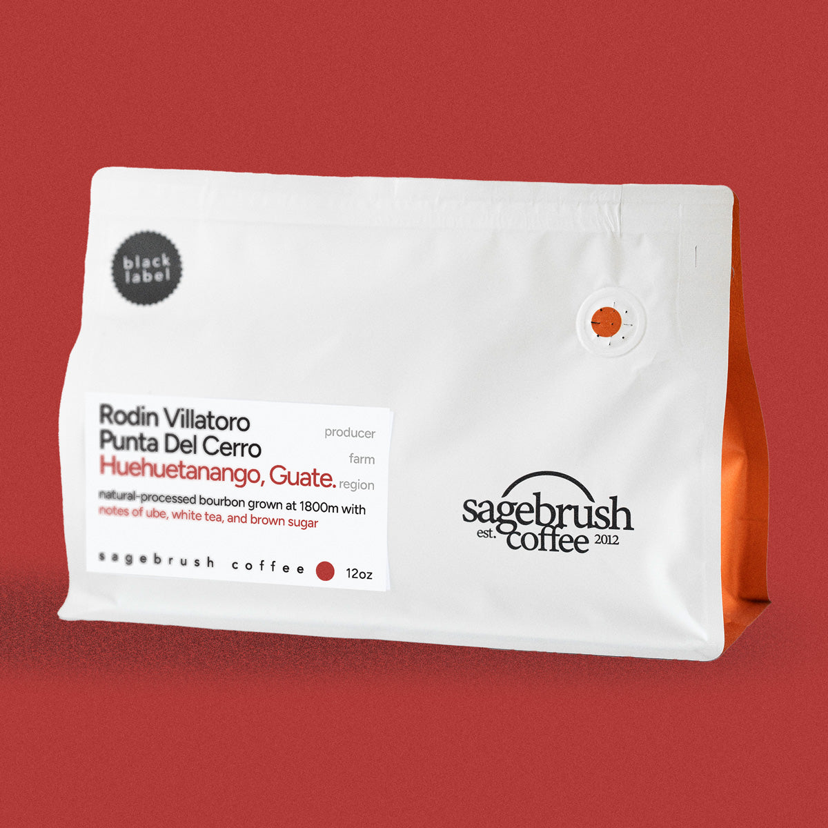
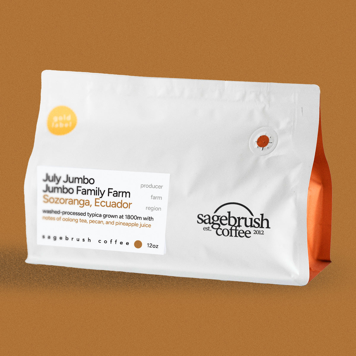
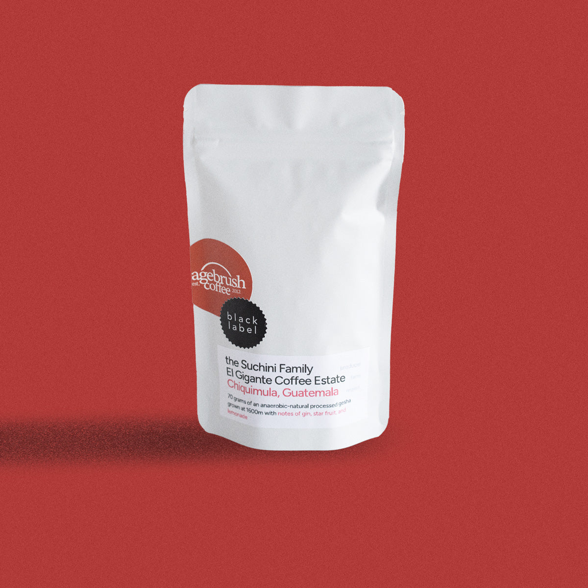
We have updated the new bags to consist of only 3 different elements (Bag, label, and the date and weight stamp). Sagebrush has invested in a professional-grade label printer and is now sourcing our bags with pre-stamped branding. Our bags no longer need to be stamped (apart from the roast date stamp), and all of our coffee labeling is printed on-site. This a substantial slimming of the margin of error, since we no longer have to rely on anyone else when we unexpectedly run out of stock of any one the elements of the bag. If there are no more labels for a certain type of coffee, all it takes is a simple click of a button and we’re right back on track with a new stack of freshly printed labels. You can now expect every bag of coffee you receive to look as clean and crisp as possible, every time, no matter what.

Problem 2:
Our bags were clunky and inconsistent
Our bags were stamped by us, humans. As humans, we can’t necessarily stamp the absolute best all the time. This led to the occasional crooked, unaligned, or under-inked stamp and in turn presented a less than pristine appearance of the bag. We also had those cardholders falling off in shipping way too often. For those of you spending hard-earned money on some of the best coffee around, we felt like improving this portion of our branding was the highest priority.
Solution:
A shift in priorities
In order to stop these packaging and aesthetic issues, we made sure the bag didn’t have any extraneous elements that might get detached from the bag. This is where the label comes in. The label is securely attached to the coffee bag and there’s absolutely no chance that it could fall off during delivery. We know what some of you are thinking: “They got rid of the card!? That was the best part of the bag!” Don’t worry, we’ve got you covered. Instead of little business cards, we are now incorporating separate informational notecards that come with every bag of coffee, displaying the details about the coffee itself. We took your feedback from the surveys into our design and included a section of the card specifically designated for taking notes on the coffee. Easily document your thoughts about the coffees to ensure you know what to order next time! These cards will be coming in an envelope with your order and a personal note from Matt.

Problem 3:
Our bags looked very monotonous
When we say monotonous, we mean monotonous. Our old bagging system left little room to distinguish between the country of origin, and the specific coffee itself was difficult to clearly present. Every bag looked the same: a card in an envelope, and that desperately needed to change. The cards were helpful, but if it got tucked down too low, you had a hard time figuring out which coffee it was. That was especially hard for us in the shop as we're packaging up your order.
Solution:
An all-new, intuitive color-coded system (Image In Header)
We have decided to tackle this problem by incorporating a new spectrum of color schemes with each scheme correlating to the country of origin. This change was not only be implemented into our packaging system, but our entire website has been streamlined to include this color system. This makes that re-orderability (yes, that's a word) much easier because the entire Sagebrush site will intuitively show which coffees are of the same origin. Plus the new schemes look pretty!

Conclusion / Personal note from Matt:
Your feedback on the surveys was hugely valuable and they helped us with several other items that factored into our design decisions. Things like not abandoning our resealable bags with the degassing value (although it is on the back now), highlighting the roast-on date on the back, the inclusion of the country of origins & a place for notes on the cards. I was surprised how many people write their own notes on the card...that makes my heart happy.
Last, I want to thank Jonathan for all of the hard work on this one. He put his heart and soul into this design and I think it's paid off. It's a unique experience to have your son help you and work so closely with you on a business and this has been a fun project. I can't wait to see what happens next year with Kellso Design (shameless promo - website to come).
